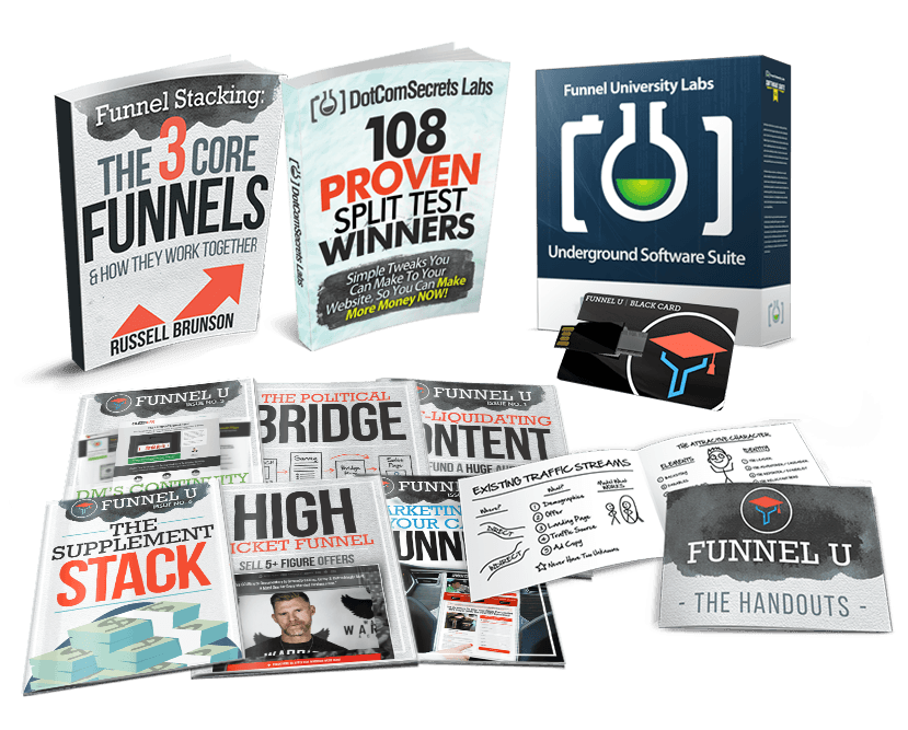
Free Book! 108 Proven Split Test Winners!
Free Book! 108 Proven Split Test Winners!
"Simple Tweaks You Can Make To Your Website, So You Can Make More Money Now!"
"Simple Tweaks You Can Make To Your Website, So You Can Make More Money Now!"
Inside Of This Free Book You'll Discover The Results To These Shocking Splits Tests:
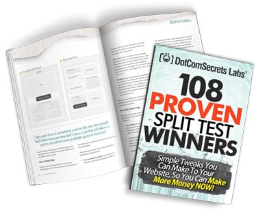
- We added ONE tiny thing to our blog, and is making us $276 for EVERY thousand visitors we get to our blog... (this one is almost dumb, cause it's SO easy to add to ANY blog) (Page 9)
- "Buy Now" VS "Free Trial" - one of them will give you a 158.6% increase - do you know which one? (Page 10)
- When do you show your order form - screw this one up and you could lose 44% of your sales (Page 11)
- The secret "Bridge" page you should show BEFORE anyone sees your video sales video - by blocking your orders with this page before they see your message, you can see up to a 59% increase in conversions! (Page 13)
- The un-obvious price drop that gave us a HUGE 616.4% INCREASE in conversions and gave us 4 times as many customers! (Page 14)
- What we learned from a recent campaign that added 41,000 new members to one sites in just 30 days (Page 15)
One Of These Landing Pages Had A 18% INCREASE In Optins, But A 31% DECREASE In Sales... Can You Guess Which One (and WHY)? (Page 75)
One Of These Landing Pages Had A 18% INCREASE In Optins, But A 31% DECREASE In Sales... Can You Guess Which One (and WHY)? (Page 75)
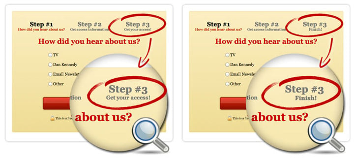


This Test Even Got Jeremy "Shoemoney" Excited!
- The mobile responsive squeeze page SCAM... don't listen to the "gurus's".. we did, and it killed our conversions by 83%... (Page 17)
- Where do you put your testimonials? Did you know that the location on the page you place them can actually INCREASE conversions on your VSL by 101% Yes, twice the number of sales without touching the VSL! (Page 18)
- The strange "Mad Libs" style squeeze page that increased conversion by up to 40%! (Page 19)
- We know it's essential to make your order forms secure, but did you know that making your squeeze pages secure can increase option conversion by 29%? (Page 20)
- Boobs VS Obama - which one wins? Knowing this could help give you a 45% conversion on your next landing page! (Page 21)
- Animated VS Static headlines... one of them will DROP your conversions by 29% - MAKE SURE YOU DON'T USE THE WRONG ONE. (Page 22)
- Offer this ONE THING for free - and see in INSTANT 55% boost in your sales! It's so easy you'll be shocked you missed it before. (Page 24)
- Should you change your offer by traffic source? YES! - Traffic from Facebook that saw this tiny offer tweak increased conversions by a WHOPPING 75.6% - yet it HURT conversions from our other traffic sources. (Page 25)
- The TWO magic words (next to your order button) that increased conversions by 28% (Page 27)
- Selling SAAS products? Should you focus on the length of the trial or the speed of singing up? One of them will increase your conversions by 30% - the other will slow signups to a screeching halt. (Page 27-28)
- How simple is your design? - cutting these 20 items OFF your landing page will increase conversion by 21% (Page 29)
- Oh ya... and did I mention that I actually GIVE you the sales script that we used that took my company from 7 figures a year... to 8 figures a year! (Just give this to any sales person and watch your business EXPLODE!!!) (Page 85-87)

The "Facebook Testimonial Trick" that increased sales by 296% (Page 58)
The "Facebook Testimonial Trick" that increased sales by 296% (Page 58)


I Showed This ONE Test To Brad Callen, And Check Out His Results:
Hey man, on Friday, I tested out the Facebook comment style testimonials vs the testimonial style we used before, which was just our own design.
The Facebook testimonial style outperformed the other, big time!
217 front ends vs 287 front ends.
That's pretty major, considering it wasn't a change to our sales video at all!”
The "Video Spoiler" box that increase sales on our VSL by an incredible 73%! After we learned this one, we added it to every VSL we had and saw very similar bumps! (Page 62)
The "Video Spoiler" box that increase sales on our VSL by an incredible 73%! After we learned this one, we added it to every VSL we had and saw very similar bumps! (Page 62)
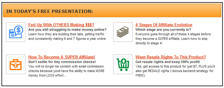
- The "Webinar Recap" block that increased our post webinar sales by 119.51% - It increased our revenue per webinar registration from $4.57 to $10.04!- AMAZING considering we didn't change ANYTHING on the actual webinar! (Page 51)
- That BIG ANNOYING button that raised our conversion by 25%! (Page 52)
- What color is your headline? If it's matching your site design, it's probably HURTING your conversions. Change them to this color and see an almost INSTANT 313% increase! (Page 53)
- DON'T SCARE COLD TRAFFIC - taking this OFF of your site will show you a 10% increase to all forms of cold traffic. (Page 54)
- This new "Micro-Commitment" style squeeze page gave us a 95% lift over our old control (which we had tested for years, and assumed was unbeatable) (Page 56)
- Everyone says that "Trust" seals will increase your conversions, but you'd be *shocked* to find out the REAL stats that they don't want you to know about. This 14% DECREASE will make you a believer. (Page 57)
- The Affiliate Hack you can add to any of your webpage that will get an instant stream of new affiliates to promote your products with out ANY extra effort! (Page 59)
- The Facebook / Order Form Trick - this one took 36 seconds to add to our order form and gave us an 80% increase in sales! (Page 60)
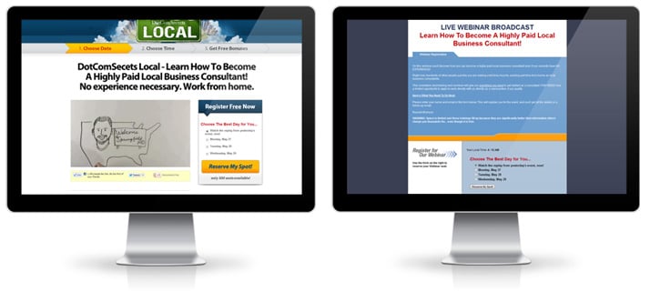
One of these webinar registration pages INCREASED our conversions by 29.45%. Can you guess which one? (it'll probably make you angry at first, and then happy later because you'll be able to fire your designer!) (Page 55)
- A new order form tweak that increased sales by 76% (Page 76-77)
- Should you do a 7 day trial or a 30 day trial? One of them will give you a 110% increase - can you guess which one? (Page 78)
- All free trials are NOT equal... Should you require a credit card or not? One option resulted in 50% MORE paid customers. (Page 79)
- One slide I added to my webinar that gave me a 25% INCREASE in sales (You can put this into ANY presentation and see similar results). (Page 81)
- The PayPal trick we use on our webinars that instantly put 35% more money into our pockets! (Page 82)
- The tiny "Offer Tweak" that gave one of our friends a 109% INCREASE in sales! (Page 83)
- Are your customers afraid to buy online? Add this to your site and get 65% of those people to buy INSTANTLY! (Page 84-85)
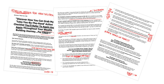
The secret "Toilet Letter" that increased our LIFETIME Customer Value from $150 to $450 - (I'll actually GIVE YOU THE LETTER we used! Just tweak it for whatever you sell and watch the money pour in!) (Page 88-93)
So, What's The Catch...?
I'm giving you this gift as a bribe, to test drive my new Funnel University newsletter and membership site.
Why would I do this?
Well, there are actually a few reasons...
1. It's my way of saying thank you for being a dedicated subscriber.
2. Because (unlike other "gurus") I don't make all of my money teaching others how to make money (I actually run real businesses online selling software, supplements, physical products and more)... so because of that, it doesn't hurt me to share with you my best stuff.
3. I get another one of my products in your hands, and when you see how awesome it is, it should get you excited to buy other stuff from me in the future. The more money I can make you now, the more likely you are to join my $25k Inner Circle program in the future.
4. I'm kinda a show off... I'm not going to lie. I'm sick of people throwing out conversion numbers and their stats without any real proof to back it up. I think 99% of what is said online is complete BS... so I thought it would be a breath of fresh air to publish the TRUTH, show the actual stats and #'s behind what we do, and well... honestly, I just want you to think I'm cool. :)

Why Time Is Of The Essence...
This is a limited offer, but even inside of that, there is REAL scarcity that you need to be aware of...
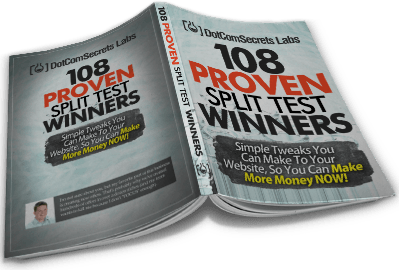
1st) I only printed 1,000 of the "108 Proven Split Test Winners" books. Yes, I can order more, but there is a 4 week lag time, so if this page is online now, then we have books in stock.
2nd) The Digital Access Pass is Going Away SOON! Because I do NOT want everyone to have all of the back archives of our past Funnel University newsletters, the Digital Access pass will be removed from this special offer VERY soon. If you don't lock in your membership NOW while this page is live... you'll NEVER be able to get back to this private members area.
3rd) This charter pricing (66% - 75% discount) AND the trial offer will not last forever. We are selling out memberships fast, and as soon as we hit our target number, we will be raising the prices back to full price. It's simple supply and demand and it's happening here in real time.
So NOW is the time to lock in your membership.

Here's What To Do Next...
Here's What To Do Next...

From here it's just finalizing the details. Click on the button below, pick what subscription plan you want to be on, and we can finally get started!
Thanks for taking the time to read this letter and watch the training video and I look forward to hearing from you soon!
Russell Brunson
P.S. In case you're one of those people (like me) who just skip to the end of the letter, here's the deal:
I'm mailing you my new book, "108 Proven Split Test Winners" along with a bunch of gifts when you join Funnel University right now! You'll get a FREE 14 day trial and get EVERYTHING listed below when you get started today!
Oh, and if for some crazy reason you don't love the book and course - I'll cancel your membership and even refund your shipping costs (and you don't have to ship it back.)
Sound fair? Then what are you waiting for!?! Let me know what subscription plan is the best for you!
Get Your Membership To Funnel University Today!
Monthly Membership
HUGE 66% Discount

Normally $197 / Month
Today Join FREE!
Plus $19.95 To Help Cover Printing & Shipping Costs
Then Just $67 / Month After 14 Days
Get Your Membership To Funnel University Today!
Monthly Membership
HUGE 66% Discount

Normally $197 / Month
Today Join FREE!
Plus $19.95 To Help Cover Printing & Shipping Costs
Then Just $67 / Month After 14 Days

Over the past 10 years, Russell has built a following of over a million entrepreneurs, sold hundreds of thousands of copies of his books, popularized the concept of sales funnels, and co-founded a software company called ClickFunnels that helps tens of thousands of entrepreneurs quickly get their message out to the marketplace.
Behind The Scenes Training
Connect With Our Community
Work With Russell
Etison LLC - ©2017 - @2020 All Rights Reserved
3443 W Bavaria St Boise, ID 83616


